
OBORU / 朧
Born from mist,
moonlight and shadow.
OBORU is a Japanese-inspired visual brand shaped by mythology, movement and the space between what is seen and what is imagined.
The idea behind OBORU
Ancient symbols.
Contemporary form.
The name OBORU draws from the Japanese idea of oboro — something seen through haze, softened by mist or moonlight.
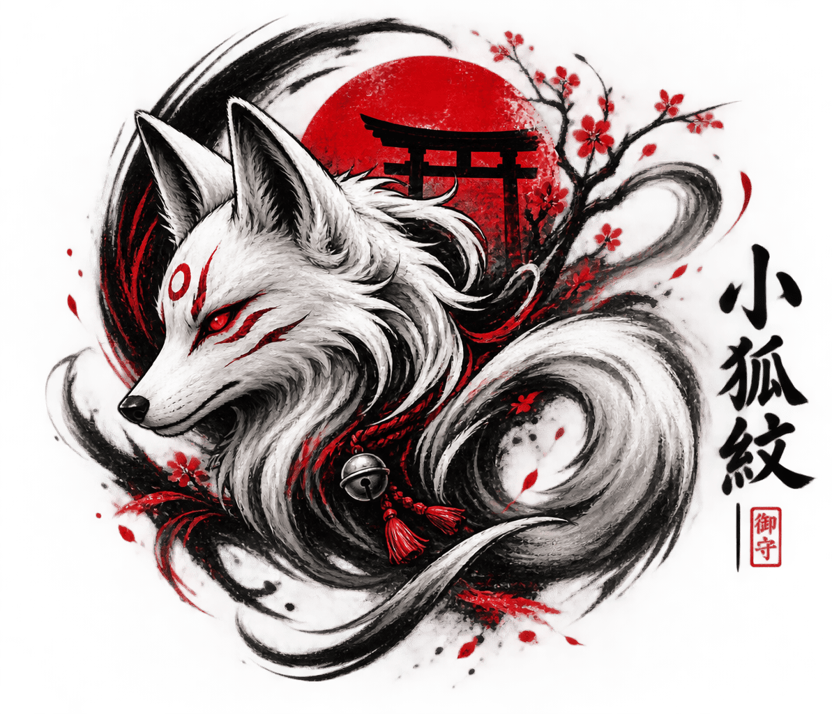
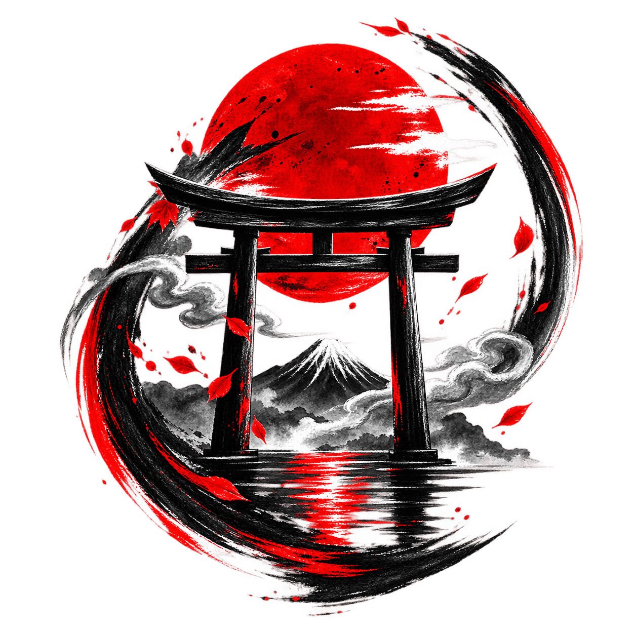
That feeling defines the visual world of OBORU. Kitsune, oni, samurai, dragons, waves, torii and other elements of Japanese visual culture are reinterpreted through a modern black, white and vermilion aesthetic.
OBORU is not about reproducing tradition. It is about creating a new visual language inspired by it — artwork designed to be worn, framed, used and carried into modern life.
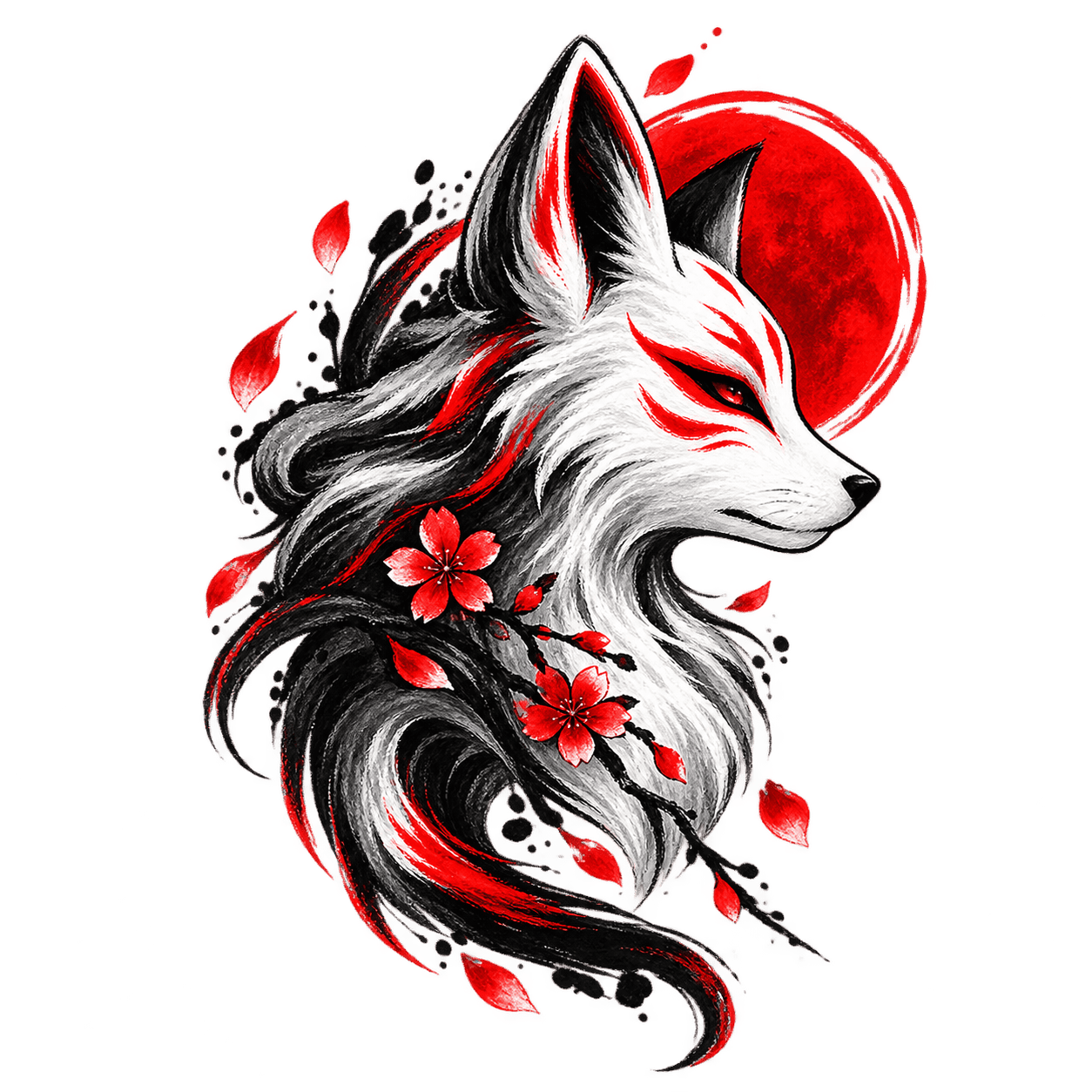

Our visual language
Black. White. Vermilion.
A restrained palette gives the artwork its identity while letting mythology, brushwork and motion remain the focus.
Black
Shadow, depth and negative space.
White
Light, contrast and clarity.
Vermilion
Energy, ritual and unmistakable presence.
Japanese symbolism
Myth, nature and traditional visual references.
What we create
One visual world.
Different forms.
OBORU artwork moves across physical products and digital formats without losing the same visual identity.

OBORU / TIMELESS SPIRITS
Timeless spirits.
Reimagined.
Japanese-inspired visual art translated into objects, spaces, clothing and machines.